

Mobile shopping is dominating e-commerce, with 79% of traffic and 68% of revenue now coming from mobile devices. Yet, mobile conversion rates lag behind desktop, averaging just 2.1% vs. 3.8%. Slow load times, clunky layouts, and poor usability are costing Shopify merchants sales. Every second of delay can drop conversions by 7%, and 40% of users leave sites that load in over 3 seconds.
To fix this, focus on:
- Choosing Shopify 2.0 themes like Dawn or Sense for faster performance and built-in mobile features.
- Optimizing layouts with larger fonts (16px+), scroll-free designs, and touch-friendly elements (48x48px).
- Improving speed by reducing image sizes, lazy loading, and removing unused scripts.
- Testing on real devices to catch usability issues missed by emulators.
With mobile now driving 72% of e-commerce traffic, improving your Shopify store’s mobile experience isn’t optional - it’s essential for staying competitive and boosting sales.
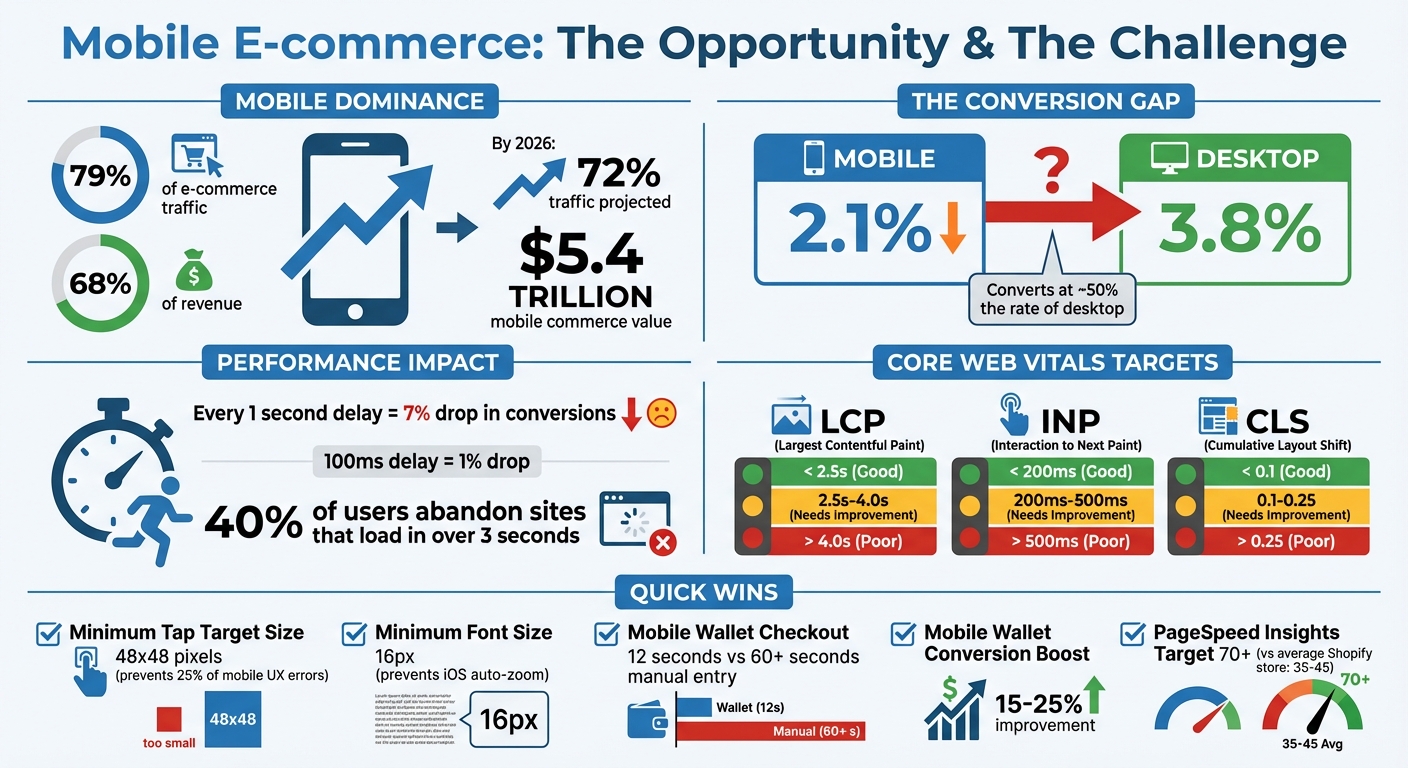
Mobile E-commerce Statistics and Optimization Impact 2026
Selecting a Mobile-Responsive Shopify Theme
The theme you choose for your Shopify store plays a huge role in how well your site performs on mobile devices, impacts user experience, and even affects SEO.
If your theme isn’t optimized for mobile, you’ll constantly need to make custom adjustments to fix issues. On the other hand, a well-designed, responsive theme takes care of mobile optimization for you.
Shopify 2.0 themes, also referred to as Online Store 2.0, are specifically designed for mobile commerce and include advanced features that older themes simply don’t offer. Themes like Dawn, Ride, and Sense boast Lighthouse scores between 88 and 92, with loading times of around two seconds. These performance metrics directly influence your conversion rates.
The difference in performance is clear. For example, the free Shopify 2.0 theme Dawn achieves a mobile Largest Contentful Paint (LCP) of 1.8 seconds, while older premium themes like Impulse take around 2.5 seconds. That 0.7-second gap might seem small, but every additional second of load time can reduce mobile conversions by about 7%. Now, let’s dig into the specific advantages of Shopify 2.0 themes.
Benefits of Shopify 2.0 Themes
Shopify 2.0 themes come packed with features that make mobile optimization seamless - features that older themes often require extra apps or custom coding to achieve. For instance, their flexible content system allows you to add, remove, or rearrange content blocks on any page without needing to touch any code. This flexibility is key for mobile design, as it lets you emphasize elements like social proof on smaller screens while hiding desktop-only content that might clutter the mobile experience.
These themes also include features like automatic WebP image conversion and lazy loading, which ensure images below the fold don’t slow down your initial page load. You can even tailor content for different screen sizes. For example, you might show a detailed size chart on desktop but use a simple pop-up link on mobile to save space. You can also rearrange sections, such as moving the "Add to Cart" button higher on mobile product pages without altering the desktop layout.
Another big advantage? Shopify 2.0 themes reduce reliance on third-party apps. Many features like countdown timers, mega-menus, and size charts are built directly into the theme. This eliminates the need for additional scripts that could otherwise slow down your mobile site.
How to Test Theme Responsiveness
After confirming that a theme includes mobile-friendly features, you’ll want to thoroughly test its performance before committing. Shopify’s "Try theme" feature lets you install a theme in trial mode. This allows you to test it with your actual products and branding without making it live. Add real products, upload your images, and set up navigation just as you would for launch.
Testing on real devices is crucial - don’t rely solely on browser emulators. Use at least one iPhone and one Android device to check for touch-specific behaviors and how the theme renders on different operating systems. While browser developer tools are helpful for quick checks, they can miss real-world issues. For instance, iOS Safari handles form inputs differently than Chrome’s emulation, so you might not notice auto-zoom problems caused by font sizes under 16px unless you test on an actual device.
Go through the entire purchase process on mobile before launching. Add items to the cart, proceed to checkout, and complete a test transaction. This will help you catch issues like small buttons, unexpected zooming, or checkout fields hidden behind sticky headers.
Use Google PageSpeed Insights to get a baseline mobile performance score - aim for at least 70. Additionally, check Google Search Console's Mobile Usability report for any flagged issues like "text too small to read" or "clickable elements too close together." These tools can help identify common problems, such as tap targets smaller than 48×48 pixels, which account for a significant portion of mobile user experience errors.
Finally, simulate slower network speeds in Chrome DevTools by throttling your connection to 3G or slow 4G. Since more than 30% of global mobile users don’t have high-speed internet, testing on a fast office network won’t give you the full picture of how your theme performs for many of your customers. Testing on real devices and under realistic conditions ensures your design works well and highlights areas where mobile performance could improve further.
sbb-itb-8b1a57a
Content Layout and Design for Mobile
After selecting your theme, fine-tuning your mobile layout and design is essential to making the most of Shopify's mobile revenue opportunities. With mobile projected to drive 72% of all ecommerce traffic by 2026, your layout needs to support clear reading, effortless navigation, and fast purchases.
Setting Readable Font Sizes
Start with your text. Body text should be at least 16px to maintain readability and avoid iOS auto-zoom problems. When text is smaller than 16px, iOS browsers zoom in on the text field, disrupting the layout and user experience. Erik D. Kennedy, Founder of Learn UI Design, explains:
"Use a text input font size of at least 16px. If your text inputs have a smaller font size than that, iOS browsers will zoom in on the left side of the text input, often obscuring the right side and forcing the user to manually zoom out."
For headings, use CSS functions like clamp() to create a font size that adjusts dynamically based on screen width. For example, adding html { font-size: clamp(14px, 2.25vw, 16px); } to your Shopify "Custom CSS" settings ensures a responsive base. Additionally, media queries can reduce heading sizes to about 90% of their desktop size, keeping the layout clean and avoiding awkward word wrapping.
| Element Type | Mobile Recommended Size | Desktop Recommended Size |
|---|---|---|
| Page Titles (H1) | 28px - 40px | 35px - 50px |
| Body Text (Text-heavy) | 16px - 20px | 18px - 24px |
| Body Text (Interaction-heavy) | 16px - 18px | 14px - 20px |
| Secondary Text / Captions | 13px - 14px | 12px - 16px |
| Text Inputs | 16px (Minimum) | 14px - 18px |
If your store uses Shopify 2.0, you can tweak typography settings through the Theme Editor's Typography scale slider, which adjusts text size in 5% increments from 100% to 150%. For text-heavy content like blog posts or product descriptions, aim for 50–75 characters per line to make reading easier.
Once your text is set, address horizontal scrolling issues to ensure a smooth mobile experience.
Preventing Horizontal Scrolling
Horizontal scrolling is a common mobile design issue and a major red flag for users. It's often caused by oversized images, tables, or fixed-width containers that don't adapt to smaller screens.
To avoid this, ensure your theme includes <meta name="viewport" content="width=device-width, initial-scale=1.0"> in the head section. Then, apply max-width: 100% and height: auto to all images so they fit within their containers.
Replace fixed pixel measurements with flexible units like percentages, em, rem, or viewport units (vw/vh). For containers, use a class like width: 100%; max-width: [desktop-width]px; padding: 0 15px; to maintain margins while keeping content within the viewport. Multi-column layouts that work on desktops should stack into a single column on mobile using media queries, typically at breakpoints like max-width: 768px.
Tables, another frequent culprit, can be replaced with collapsible accordion sections or horizontal swipe containers for wide data. Tools like Flexbox (display: flex; flex-wrap: wrap;) and CSS Grid help wrap content naturally without overflow. Always test your design on real devices, as browser tools like Chrome DevTools can't replicate every issue that might appear on actual smartphones.
Once scrolling is fixed, shift your focus to optimizing product grids for mobile shoppers.
Adjusting Product Grids for Mobile
Product grids are crucial because they directly affect how customers browse and buy. Stick to one or two columns maximum on mobile. Compressing images into three or more columns makes them too small and reduces tap target sizes.
Ensure interactive elements like "Add to Cart" buttons, variant selectors, and product cards are at least 44–48px, with a minimum of 8px spacing between tap targets to prevent accidental clicks. Replace dropdown menus for options like size or color with large, tappable swatches or pill buttons that meet the 44px minimum.
Position key actions like "Add to Cart" in the lower-center or lower-right areas of the screen - these are the most accessible zones for right-handed users. Display product prices directly on grid cards without requiring a hover or tap, as hidden prices can reduce click-through rates by 18%.
Use full-width product images with horizontal swipe galleries and pinch-to-zoom capabilities. Specify width and height attributes for grid images to reduce Cumulative Layout Shift during page load, improving mobile performance scores. Simplify the layout by removing unnecessary elements - mobile users typically spend only two minutes on a page, compared to five minutes on desktop.
Mobile Navigation and Touch Interactions
Once your content layout is optimized for mobile, the next step is refining navigation and touch interactions to improve usability. Since fingers lack the precision of a mouse, mobile users expect larger, more responsive touch targets. Perfecting these elements can be the difference between a completed purchase and a frustrated customer abandoning your site.
Streamlining Navigation Menus
A clean, straightforward menu is essential for mobile users. Keep the menu depth to two levels at most, as deeper menus can overwhelm users and make it harder to locate products. Prioritize high-intent links like "Shop", "Collections", and "Sale" at the top, while moving less critical options like "About" or "Blog" to the bottom, where they won't distract shoppers.
Use clear, descriptive labels instead of creative names. For example, "Women's Shoes" is far more intuitive - and better for SEO - than something like "The Freedom Collection". Keep the top-level menu limited to 5–7 core categories to avoid clutter. Additionally, when the mobile menu drawer is open, lock the background page to prevent accidental scrolling.
A visible search icon in the header is a must-have. 73% of mobile users rely on search functions when shopping online, and many prefer typing over navigating complex menus. Poor navigation is responsible for losing an estimated 50% of potential sales.
For stores with just a few primary destinations, consider adding a fixed bottom navigation bar with icons for essential tools like Home, Search, Cart, and Account. Placing these tools in the "thumb zone" - the lower-center and lower-right areas of the screen - makes them easy to reach.
Creating Touch-Friendly Buttons
Buttons and links on mobile need to accommodate fingers, not cursors. Ensure all interactive elements are at least 48x48px with a minimum of 8px spacing between them. Tap targets smaller than 48x48px contribute to 25% of mobile UX errors.
Position critical action buttons, like "Add to Cart", in the lower-center or lower-right parts of the screen, where thumbs naturally rest. A sticky bottom "Add to Cart" bar (no taller than 56px) that appears when the main button scrolls off-screen can boost add-to-cart rates by 8–15%.
Interactive elements should provide immediate feedback - whether through a color change, animation, or even haptic feedback - to confirm the action and prevent duplicate clicks. And remember, any interaction that relies on mouse hover states won't work on touchscreens, so these should be removed.
Improving Mobile Image Galleries and Sections
Mobile users expect intuitive gestures like horizontal swiping and pinch-to-zoom when browsing product images. Full-width product images that fill the screen provide a better experience, and thumbnails should not cause the main image to resize unexpectedly, as this disrupts usability.
To avoid layout shifts that frustrate users and hurt performance scores, set explicit aspect ratios for image sections to reserve space before files load. For sharp visuals on high-resolution screens, upload source images at approximately 2x the maximum display size, but avoid unnecessarily large file sizes.
Use collapsible accordion sections for product descriptions, shipping details, and reviews. This approach keeps pages scannable while allowing users to expand sections for more information. Present only the most critical details - like product name and price - upfront, with additional details accessible through taps.
Mobile Performance Optimization
Every fraction of a second counts when it comes to mobile performance. A delay of just 100ms can lower conversions by 1%, and every additional second can reduce conversions by around 7%. With mobile expected to account for 72% of eCommerce traffic by 2026, but converting at only about half the rate of desktop, improving performance is more important than ever.
Testing and Improving Mobile Load Speed
Start by evaluating your site's mobile speed with Google PageSpeed Insights, which provides both lab simulations and real-world data. Most Shopify stores score between 35–45 on mobile, but aiming for a score above 70 can help you stay ahead of the competition.
Shopify's Web Performance Dashboard is another valuable tool. It uses Real User Monitoring data to track Core Web Vitals like Largest Contentful Paint (LCP), Interaction to Next Paint (INP), and Cumulative Layout Shift (CLS. For deeper insights, tools like GTmetrix and Chrome DevTools can help identify bottlenecks such as unused JavaScript or CSS.
Here’s what you should aim for with Core Web Vitals:
| Metric | Good (Target) | Needs Improvement | Poor |
|---|---|---|---|
| LCP (Largest Contentful Paint) | < 2.5s | 2.5s – 4.0s | > 4.0s |
| INP (Interaction to Next Paint) | < 200ms | 200ms – 500ms | > 500ms |
| CLS (Cumulative Layout Shift) | < 0.1 | 0.1 – 0.25 | > 0.25 |
While automated tools are helpful, don’t stop there. Test your site on real iPhone and Android devices using cellular networks like 3G or 4G - not just WiFi - to better understand your customers' experience. As Shopify's Image Optimization Guide explains:
"Mobile connections are slower and more variable than desktop broadband, making every kilobyte of unnecessary JavaScript and every unoptimized image disproportionately painful on mobile".
These steps are the foundation for meaningful improvements.
Reducing Image and Script Load Times
Images make up 21% of a page's weight on average, and this can jump to 40–60% for product-heavy stores. To reduce load times:
- Convert images to WebP for 25–35% smaller file sizes compared to JPEG, or use AVIF for even better compression (40–50%).
- Keep image quality between 75–85 to shrink file sizes by 50–70% without compromising visual appeal.
- Ensure product images stay under 200 KB and mobile hero images under 100 KB.
-
Use
loading="eager"for hero images to prioritize loading andloading="lazy"for images below the fold.
Scripts can also drag down performance. Each installed app can add 50–200ms of latency, so removing unused apps is an easy win. For scripts that aren’t immediately needed, defer or delay them. For example, analytics and review scripts can load later, and heavy third-party widgets like live chat should only activate after user interaction.
Once you’ve slimmed down your resources, focus on creating a stable page layout.
Preventing Layout Shifts
Frequent or unexpected layout changes can frustrate users. To keep your Cumulative Layout Shift (CLS) score below the recommended 0.1, take proactive measures. The median Shopify store scores around 0.12, and anything above 0.25 can make a page feel unreliable.
Here’s how to minimize layout shifts:
-
Always define explicit
widthandheightattributes for images, so browsers can allocate space before loading. Shopify's Liquidimage_tagfeature automatically includes these dimensions. -
For dynamic content like banners or reviews injected by apps, use CSS to set a minimum height on containers (e.g.,
.shopify-app-block) to avoid sudden jumps. -
Optimize font loading with
font-display: swapand fallback fonts, using properties likesize-adjustandascent-override. Alternatively, system fonts like San Francisco or Segoe UI can eliminate the need for additional network requests.
Working with Martin Monroe Creative for Mobile Optimization
Martin Monroe Creative's Shopify Experience
With mobile traffic now accounting for 72% of e-commerce visits in 2026, the stakes for mobile optimization are higher than ever. Yet, mobile conversion rates still lag behind desktop by about 50%, creating a big gap in potential revenue for many online stores. That’s where professional help comes in. Martin Monroe Creative specializes in Shopify e-commerce design, offering solutions for mobile challenges that many merchants struggle to tackle alone.
Their team brings hands-on experience with Shopify 2.0 themes like Dawn and Sense, using these frameworks to create mobile-specific content blocks and improve performance based on each store's unique needs. They also fine-tune Liquid code, deferring non-essential scripts and optimizing key components - technical tasks that are often beyond the scope of most store owners.
Shopify Optimization Services Available
Martin Monroe Creative focuses on addressing the most pressing mobile performance issues to give Shopify stores a real edge. They target areas like mobile load speeds, reducing image and script load times, and minimizing Cumulative Layout Shift (CLS). While the average Shopify store scores just 35–45 on Google's mobile PageSpeed Insights, their optimizations aim for a score of 70 or higher, which can make a huge difference in user experience and competitiveness.
To improve navigation, they design layouts that are easy for mobile users to interact with. This includes thumb-friendly designs, sticky bottom bars, clear search icons, and properly sized tap targets (meeting the 48x48 pixel standard). They also add swipe gestures for image galleries and integrate mobile wallets like Apple Pay, Google Pay, and Shop Pay. These wallets not only streamline the checkout process - cutting it down from over 60 seconds to about 12 seconds - but they also boost conversion rates by 15–25% compared to manual card entry.
Beyond performance, their services extend to branding and UI/UX customization, ensuring a polished, consistent look across all screen sizes. They use modern tools like Flexbox and CSS Grid to achieve this. Additionally, their audits focus on removing unnecessary code and consolidating functions, which can be a daunting task for most store owners.
Martin Monroe Creative’s approach combines these targeted services with broader optimization strategies, helping merchants deliver fast, seamless, and visually appealing mobile experiences.
Conclusion
Mobile responsiveness is no longer just a nice-to-have - it's the backbone of a thriving Shopify store. With mobile commerce projected to hit $5.4 trillion by 2026, how your store performs on mobile devices can make or break your success. The gap in conversions between mobile and desktop is a golden opportunity for merchants who take the right steps.
This checklist offers a practical roadmap to tackle these challenges head-on. It covers everything from choosing a Shopify 2.0 theme to fine-tuning load speeds, ensuring your store meets modern mobile expectations. Simple improvements like maintaining 48x48 pixel tap targets, enabling mobile wallets, and aiming for a PageSpeed Insights score of 70+ can lead to noticeable conversion boosts.
If technical hurdles feel overwhelming, expert help is within reach. Martin Monroe Creative provides specialized Shopify mobile optimization services, from performance audits to custom design solutions, empowering merchants to close the conversion gap and thrive in today’s mobile-first world.
Start by implementing these key strategies, test your store on real devices, and don’t hesitate to seek professional support when needed. Both your customers and your bottom line will thank you.
FAQs
What’s the quickest way to tell if my Shopify theme is truly mobile-ready?
To quickly determine if your Shopify theme is optimized for mobile, try a mobile-friendly test like Google's tool. Just input your store's URL, and you'll get feedback on potential problems like small text, tightly packed elements, or images that aren't optimized. Additionally, make sure your theme incorporates responsive design, includes the proper viewport meta tag, and uses mobile font sizes of at least 16px for better readability.
Which Core Web Vitals should I focus on first for mobile conversions?
To improve mobile performance and drive conversions, start with Largest Contentful Paint (LCP). This metric directly impacts load speed and user experience, both crucial for mobile users. After that, tackle Cumulative Layout Shift (CLS) to maintain visual stability, ensuring content doesn't unexpectedly shift on the screen. Finally, focus on Interaction to Next Paint (INP) to make interactions feel more responsive. Prioritizing these steps in this order will help create a smoother, faster mobile experience.
How can I reduce mobile load time without sacrificing image quality?
To make mobile pages load faster without sacrificing image quality, use responsive images that automatically adjust to the size of the device. Choose the right image formats and apply compression to shrink file sizes, particularly for images larger than 200–300 KB. Tools like Lighthouse can pinpoint oversized images that need tweaking. This way, your images remain sharp while loading quickly on mobile devices.