
Google now ranks websites based on their mobile version, not the desktop one. That means your Shopify store needs to be fast, user-friendly, and easy to navigate on phones to stay visible in search results. Here’s what you need to know:
- Why it matters: Most shoppers use mobile devices, and Google prioritizes mobile-friendly sites for rankings.
-
Key factors to optimize:
- Page speed
- Simplified navigation
- Mobile-friendly content
- Smooth checkout process
- Tools to test your store: Use Google’s Mobile-Friendly Test and Search Console reports to identify issues.
-
Action steps:
- Pick a responsive Shopify theme.
- Compress images and clean up code for faster loading.
- Ensure your mobile content matches your desktop version.
Pro Tip: Hiring mobile optimization experts can save time and improve performance faster.
Mobile-first indexing is no longer optional - it’s the baseline for success in e-commerce. Start testing and optimizing your Shopify store today to boost visibility and sales.
Understanding Mobile-First Indexing
Google now evaluates your Shopify store primarily through its mobile version. This version serves as the foundation for determining your search rankings and visibility. This shift changes how search engines assess your store's content, structure, and performance.
How It Affects Your Shopify Store Rankings
Here’s how mobile-first indexing can influence your store’s visibility:
- Content Accessibility: Any content hidden or collapsed on mobile might not be indexed, which can hurt rankings.
- Loading Speed: Mobile page speed plays a big role in ranking.
- User Experience: Metrics like mobile engagement directly impact how your store ranks in search results.
Mobile vs Desktop Indexing
To understand why mobile optimization is different from desktop strategies, take a look at this comparison:
| Aspect | Desktop-First Indexing | Mobile-First Indexing |
|---|---|---|
| Primary Content Source | Desktop version | Mobile version |
| Content Priority | Full desktop content | Only visible mobile content |
| Page Speed Requirements | Standard | Stricter thresholds |
| Screen Size Consideration | Large screens prioritized | Small screens prioritized |
| Navigation Structure | Complex menus acceptable | Simplified navigation required |
Important Technical Details
- Make sure your mobile site has the same structure and content as your desktop version.
- Use identical structured data and meta robots tags for both versions.
- Ensure your mobile site is easy for search engines to crawl and access.
This focus on mobile optimization is now crucial for keeping your Shopify store visible in search results and driving e-commerce growth.
Testing Your Store's Mobile Performance
Evaluate your Shopify store's mobile performance effectively by using specific tools and tracking key metrics.
Google Mobile-Friendly Test Guide
- Go to Google's Mobile-Friendly Test page.
- Enter your store's URL.
- Analyze the report for areas like text size, viewport settings, tap target spacing, and content width.
This tool identifies issues that could interfere with how your store appears and functions on mobile devices.
Search Console Mobile Reports
| Report Type | Focus Areas | Key Metrics to Watch |
|---|---|---|
| Mobile Usability | Page-level issues | Clickable elements, viewport setup, text size |
| Core Web Vitals | Loading and interaction | Largest Contentful Paint (LCP), First Input Delay (FID), Cumulative Layout Shift (CLS) |
Start by resolving problems flagged under Mobile Usability. Once those are fixed, shift your attention to the technical aspects in Core Web Vitals.
Mobile Performance Metrics
Keep an eye on these critical metrics to ensure your store runs smoothly on mobile:
- Load times: Slow-loading pages can drive users away and hurt conversions.
- Technical metrics: Focus on FCP (First Contentful Paint), LCP, FID, and CLS to measure performance.
- User behavior: Track bounce rates, session durations, conversion rates, and how far users scroll on your pages.
Set up Google Analytics dashboards to monitor these metrics regularly. This helps you catch and address issues early, keeping your store's performance and search rankings intact.
sbb-itb-8b1a57a
Mobile Optimization Steps for Shopify
Once you've pinpointed performance issues, it's time to take action. Here's how to optimize your Shopify store for mobile users.
Choosing Mobile-Friendly Themes
Pick a Shopify theme designed to adapt to any screen size. Look for these essential features:
| Feature | Why It Matters | What to Look For |
|---|---|---|
| Responsive Navigation | Makes browsing easy on mobile devices | Menus that adjust seamlessly for touch |
| Flexible Grid System | Keeps layouts consistent across devices | Product grids that resize smoothly |
| Adaptive Images | Ensures visuals look great on all screens | Images that resize without distortion |
| Touch-Friendly Elements | Improves interaction on touchscreens | Buttons and links that are easy to tap |
Boosting Mobile Speed
Faster mobile load times mean happier users and better rankings. Here's how to speed things up:
Image Optimization
- Compress product images using Shopify's built-in tools.
- Enable lazy loading to delay loading offscreen images.
Code Optimization
- Minify CSS and JavaScript files to reduce page load times.
Writing Mobile-Friendly Content
Keep your content simple and easy to read on smaller screens:
- Stick to short sentences and paragraphs.
- Highlight the most important information for quick scanning.
Working with Mobile Optimization Experts
Optimizing for mobile requires technical skills, and professionals can help you achieve results more efficiently.
Martin Monroe Creative Services
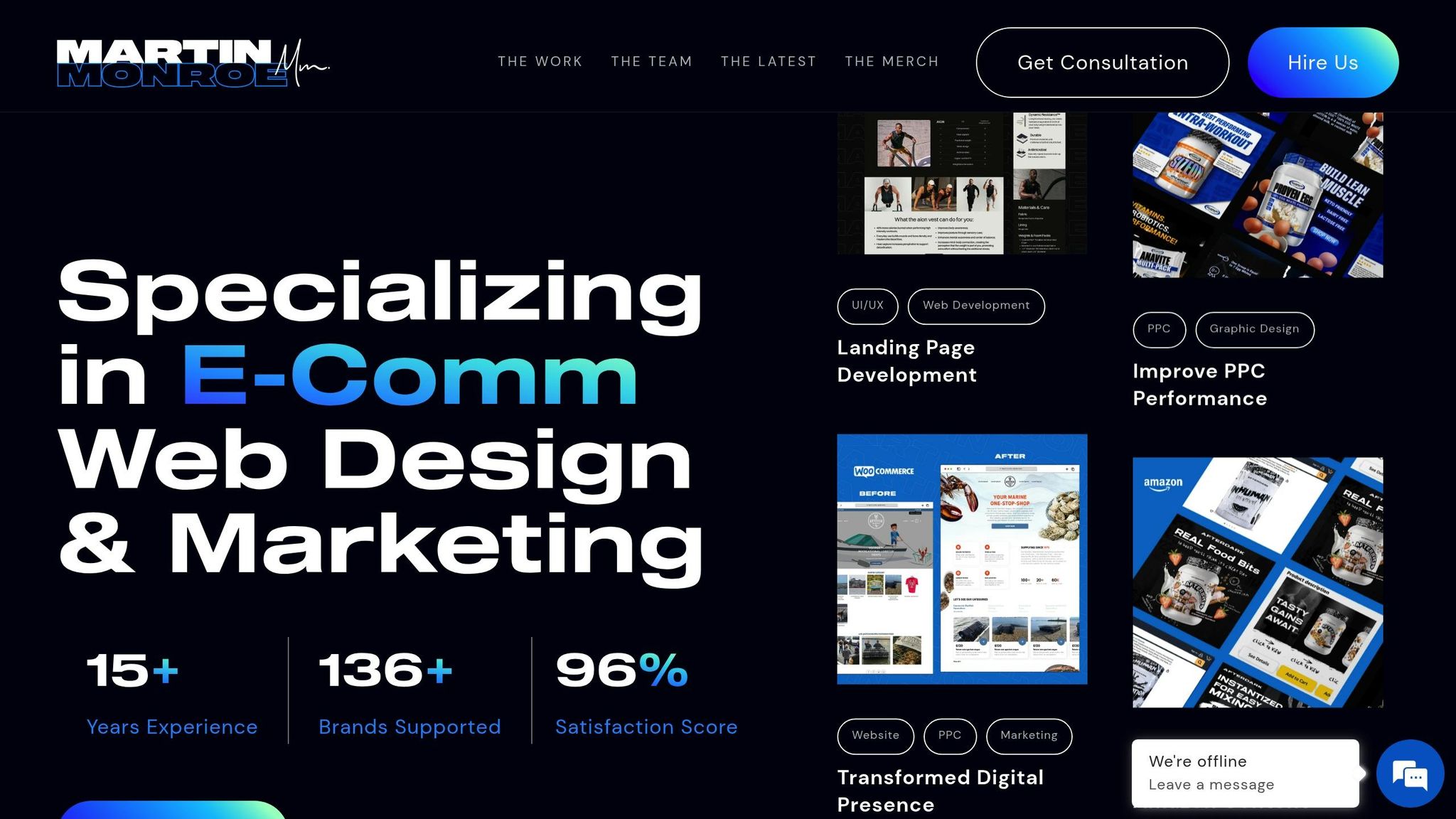
Martin Monroe Creative specializes in improving mobile performance. Their team focuses on UI/UX design and web development to enhance navigation, reduce load times, and increase user engagement. Their structured approach ensures every aspect of mobile optimization is addressed.
Here are two standout examples of their work:
"Martin Monroe transformed our website with their innovative design and significantly improved our online presence. Their team was professional and responsive throughout the entire process."
– Elijah M., CNC
Powering Fitness is a prime example of their success, growing from $300,000 to $8 million in sales in just 18 months by combining mobile optimization with a strong marketing strategy.
These examples show how working with experts can make a big difference.
Why Hire Professionals
For Shopify stores aiming to thrive in a mobile-first world, hiring professionals offers distinct advantages:
-
Expert Analysis and Implementation
Professionals bring in-depth knowledge of mobile requirements and access to advanced tools for testing and optimization. -
Time and Resource Efficiency
They implement changes faster and provide ongoing monitoring, saving you from trial-and-error efforts.
One notable success story is From Shore to Door, a direct-to-consumer seafood brand. They achieved over $1 million in revenue within 12 months by using expert mobile optimization and development services.
"Working with Martin Monroe was a game-changer for our digital marketing strategy. Their creative approaches led to a noticeable increase in engagement and sales." – Kristen C., LWO
When choosing a mobile optimization partner, keep these factors in mind:
| Selection Criteria | Why It Matters | What to Look For |
|---|---|---|
| Experience | Shows expertise in e-commerce optimization | Years of proven industry experience |
| Portfolio | Demonstrates quality and capabilities | Successful mobile-first projects |
| Client Results | Validates their effectiveness | Documented performance improvements |
| Service Range | Ensures they cover all needs | Full-stack optimization services |
Hiring professionals can deliver faster and more effective results compared to trying to do it yourself, making it a worthwhile investment for mobile success.
Summary and Next Steps
Focusing on mobile-first indexing is crucial for Shopify store success. Here are key areas to address:
| Priority Area | Key Actions | Expected Impact |
|---|---|---|
| Theme Selection | Use responsive, mobile-optimized themes | Better user experience and faster loading |
| Speed Optimization | Compress images and streamline code | Higher search rankings and fewer bounce-offs |
| Content Adaptation | Use layouts suited for mobile screens | Improved readability and engagement |
| Technical Setup | Set up proper mobile viewport settings | Consistent display on all devices |
Steps to Implement These Priorities:
-
Evaluate Your Current Mobile Performance
Start with a mobile audit. Use tools like Google's Mobile-Friendly Test and Search Console to pinpoint problem areas and opportunities for improvement. -
Apply Technical Fixes
Optimize your site’s design and functionality for mobile users. Agencies like Martin Monroe Creative, which specializes in Shopify e-commerce, can help you align with modern mobile standards and deliver a smooth user experience. -
Revise Your Content for Mobile
Adjust your content to cater to mobile users by:- Tailoring product descriptions for smaller screens
- Simplifying navigation to make it thumb-friendly
- Adding clear, easy-to-tap calls-to-action