
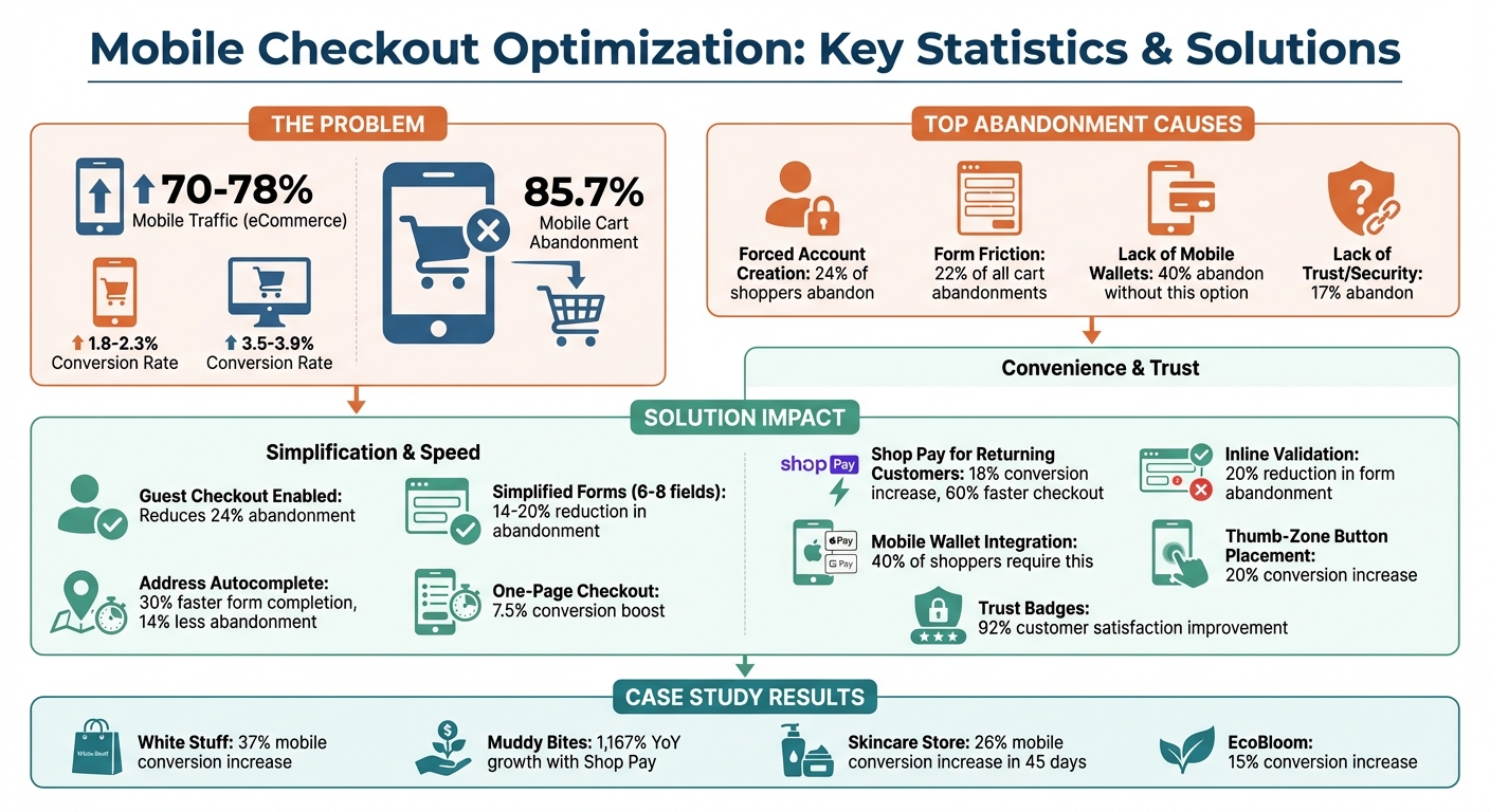
Mobile shopping dominates eCommerce, driving 70-78% of traffic and over two-thirds of orders. Yet, mobile checkout conversion rates (1.8-2.3%) trail behind desktop (3.5-3.9%), with 85.7% of mobile carts abandoned. The good news? Small changes to the checkout process can recover lost revenue.
Key solutions include:
- Simplify forms: Reduce unnecessary fields and enable address autofill.
- Enable guest checkout: Avoid forcing account creation, which deters 24% of shoppers.
- Offer mobile wallets: Apple Pay, Google Pay, and Shop Pay reduce friction and speed up payments.
- Optimize for touch: Use larger buttons, thumb-friendly layouts, and sticky CTAs.
- Build trust: Display security badges, clear order summaries, and instant payment confirmation.
These strategies improve user experience, boost conversion rates, and help Shopify stores capitalize on mobile traffic.
Mobile Checkout Optimization Statistics and Impact
Simplifying the Checkout Process
One-Page vs. Multi-Step Checkouts
Choosing between a one-page or multi-step checkout isn't about picking a universal winner - it’s about understanding your customers’ shopping habits. One-page checkouts combine contact, shipping, and payment details into a single scrollable page, reducing clicks and transitions. This setup is ideal for quick, impulse buys, especially for items priced under $150. On average, switching to a one-page checkout can boost conversions by 7.5% [8].
On the other hand, multi-step checkouts divide the process into clear stages like "Information → Shipping → Payment." This layout minimizes scrolling fatigue, particularly on mobile devices, and works better for higher-priced items (over $200) or complex B2B orders. With progress indicators like "Step 2 of 3", it reassures customers about their progress, making it a solid choice for more detailed transactions. For instance, fashion retailer White Stuff revamped their checkout process, doubling their mobile site speed and increasing conversions by 37% [2].
Regardless of format, reducing friction is key. Features like eliminating mandatory accounts and streamlining form interactions can further enhance the checkout experience.
Allow Guest Checkout
Requiring customers to create an account before purchasing is a surefire way to lose sales. In fact, 24% of shoppers abandon their carts when forced to register [3]. Tasks like creating passwords or confirming emails can feel like unnecessary obstacles, especially on mobile devices where typing on smaller keyboards is cumbersome [5].
Shopify makes enabling guest checkout simple. Go to Settings → Checkout → Customer accounts and select "Accounts are optional" [5]. You can still encourage guest shoppers to create accounts later by adding a "Save your details for next time" prompt on the Thank You page. This method converts 65% to 80% of guest shoppers into account holders without disrupting their initial purchase [5].
Make Navigation Easy to Use
Few things frustrate mobile shoppers more than encountering an error and losing all their progress while trying to fix it. Inline validation solves this by flagging mistakes (like an invalid email) in real time, reducing form abandonment by up to 20% [5].
Autocomplete is another game-changer, suggesting address details as users type. This feature can cut form completion time by 30% and reduce checkout abandonment by 14% [5]. For multi-step checkouts, ensure users can easily go back to edit details - like their shipping address or payment method - without restarting the process. These small but impactful navigation improvements create a smoother, more user-friendly checkout flow, setting the stage for a seamless mobile shopping experience.
sbb-itb-8b1a57a
Optimizing Forms for Mobile Devices
Minimize Required Fields
Did you know the average large e-commerce checkout has around 14.88 unnecessary form fields? That’s a lot of extra work for customers. In fact, form friction causes 22% of all cart abandonments. And since mobile devices already see higher abandonment rates, trimming down your forms can make a real difference [5][3][11].
Start with the basics: consolidate your name fields. In Shopify, go to Settings > Checkout > Customer information and merge "First Name" and "Last Name" into one field [9]. Next, get rid of fields that don’t directly impact order fulfillment. For example, eliminate options like "Company Name" (for B2C stores), "Title" (Mr/Mrs), "Fax Number", and "Birthday" [5][2]. You can also set fields like "Address Line 2" and "Shipping Address Phone Number" to Optional or even remove them entirely, as they’re often unnecessary [9].
Here’s a quick guide to common form fields and how to handle them:
| Field | Recommended Action | Why It Matters |
|---|---|---|
| Full Name | Combine into one field | Simplifies the form [9] |
| Company Name | Remove for B2C stores | Not needed for most consumer orders [5] |
| Address Line 2 | Optional or hide | Rarely required for delivery [9] |
| Phone Number | Optional | Reduces friction; only ask if necessary [9] |
| Coupon Code | Hide behind a link | Keeps the layout uncluttered [10][5] |
Another tip? Default the billing address to match the shipping address. Over 95% of consumer orders use the same address for both, so don’t make customers enter it twice [5]. By cutting out these extra steps, you’ll speed up the process and create a smoother mobile checkout experience.
Use Autofill and Smart Input
Typing on mobile can be tedious, so let autofill do the heavy lifting. Enable Google Autocomplete in your Shopify settings to allow customers to complete their address with just a few keystrokes [7][3].
Take it a step further by using smart input fields. For example:
-
Use
type="tel"for phone numbers to bring up a numeric keypad. -
Use
type="email"for email fields so keys like "@" and ".com" are easily accessible. -
Use
inputmode="numeric"for credit card fields to display a large, number-friendly keypad [14][15][7].
For returning customers, Shop Pay can significantly improve the experience, boosting conversion rates by 18% and cutting checkout time by 60% by auto-filling payment and shipping details [4][13]. First-time buyers can also benefit - Shopify’s "Save this information for next time" option stores their details in the browser for up to a year, making future checkouts faster and easier [9].
Design for Touch and Accessibility
Mobile checkout isn’t just about fewer fields - it’s about designing for touch. Make sure tappable elements like buttons, checkboxes, and radio buttons are at least 44 x 44 pixels. Anything smaller might frustrate users, especially those with larger fingers or those shopping on the go [14][2]. Similarly, set input field text to at least 16px. If it’s smaller, iOS might zoom in automatically when a user taps the field, disrupting their experience [2].
Stick to a single-column layout for your form fields. While side-by-side fields may work on desktop, they can force mobile users to zoom or scroll horizontally, adding unnecessary hassle [14][15][3]. And instead of placeholder text that disappears when users start typing, use floating labels that stay visible above the field. This helps users keep track of what they’re filling out, especially since nearly half of mobile users operate their devices with one hand [2][7].
Adding More Payment Methods
Add Mobile Wallets
Mobile wallets have become a must-have for online stores. Research indicates that 40% of shoppers will abandon their purchase if mobile wallets aren't available [2]. Let’s face it - typing out a 16-digit card number on a tiny phone screen is a hassle. Mobile wallets take that pain away, making the checkout process seamless.
To get started, enable Apple Pay, Google Pay, and Shop Pay in your Shopify settings. These wallets use saved payment details, turning what could be a multi-step process into a simple tap [2]. For example, Apple Pay works best for iOS users browsing on Safari, cutting checkout times down to just 5–8 seconds. Meanwhile, Google Pay helps bridge the "Android gap." Even though Android makes up 40–45% of the U.S. mobile market, fewer than 35% of Shopify stores have enabled Google Pay [17][20].
Mobile wallets also add a layer of security. They use tokenization and biometric authentication (like Face ID or fingerprint scanning), which lowers chargeback rates by 99.6% compared to physical card transactions [16]. With an estimated 4.5 billion people expected to use digital wallets globally by 2025, offering these payment options is more than just a convenience - it’s a necessity [16]. Once you’ve set up mobile wallets, the next step is to ensure payment buttons are placed strategically.
Position Payment Buttons Correctly
Adding mobile wallets is only part of the equation. Where you place the payment buttons can make or break the checkout experience. Don’t bury them at the bottom of the page or after manual card entry fields. Instead, display wallet buttons prominently on product pages and cart pages. This allows customers to skip the traditional checkout flow entirely [18][19].
Consider using a vertical button layout for express checkout options. In Shopify, you can apply the additional-checkout-buttons--vertical class to stack buttons vertically. This layout creates larger tap areas, which are especially useful on mobile screens [2]. To avoid tap errors, make sure all buttons are at least 44–48 pixels tall [2][12].
Here’s a real-world example: A Shopify skincare subscription store partnered with Frontlevels in 2024 to reduce mobile abandonment. By placing Apple Pay and Shop Pay buttons directly on product and cart pages, they saw a 26% increase in mobile conversions within 45 days - all without increasing ad spend [1].
Another tip? Position payment buttons in the "thumb zone" - the lower-middle area of the screen that’s easy to reach with one hand. Since nearly half of users operate their phones with one hand, this small adjustment can increase conversions by over 20% [17].
Use Shop Pay for Returning Customers
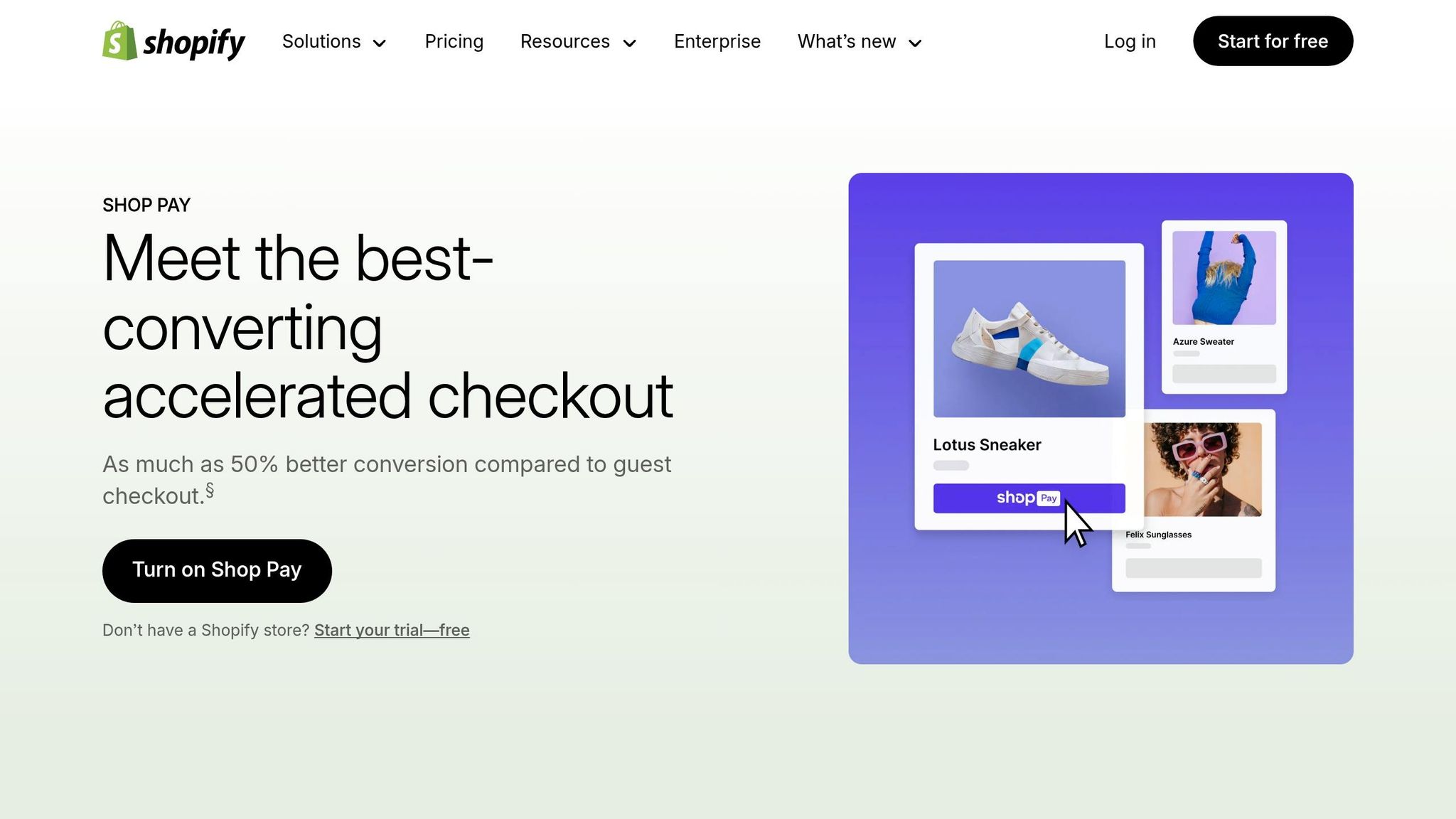
If you’re looking to speed things up even more for repeat buyers, Shop Pay is the answer. With over 100 million users, Shop Pay offers a true one-click checkout experience [16]. It cuts repeat checkout times by 60%, completing purchases in just 0.7 seconds [4]. Plus, Shop Pay checkouts convert at 1.91 times higher rates on mobile compared to standard checkouts [3].
The advantages don’t stop there. Shop Pay users generate 77% more repeat purchases and have 15% higher order values [2]. The autofill feature reduces friction, making it easier for customers to complete their orders.
Here’s how it worked for Muddy Bites, a snack brand. In 2023, their CEO, Jarod Steffes, credited Shop Pay’s one-click system for their 1,167% year-over-year growth and an 8% increase in completed return customer orders. As he puts it:
To replicate this success, enable Shop Pay in your Shopify settings. Make sure the "Save this information for next time" option is visible during checkout. This feature not only makes future purchases easier for first-time buyers but also delivers an average 9% boost in conversion rates - and an 18% increase for returning customers.
Designing for Mobile Screen Ergonomics
Making mobile screens more ergonomic is key to tackling checkout challenges and reducing cart abandonment.
Apply Thumb Zone Principles
Nearly half of mobile users - 49% - navigate their phones with just one hand, so placing checkout buttons where thumbs naturally rest is a smart move[21].
Picture your mobile screen divided into three zones. The Green Zone, located at the bottom center, is where the thumb naturally lands. This is the perfect spot for critical actions like "Checkout", "Next", or "Place Order." The Yellow Zone, in the middle of the screen, is reachable but requires a bit of a stretch, so it’s better suited for secondary actions, such as adjusting item quantities. Finally, the Red Zone, in the top corners, is the hardest to reach with one hand. This area works best for non-essential elements like logos or supplementary information[21].
When buttons are awkwardly placed, mobile bounce rates can jump by as much as 20%[21]. With mobile cart abandonment rates reaching a staggering 85.65%[6], ensuring critical buttons are thumb-friendly is a no-brainer.
Use Fixed Checkout Buttons
Sticky buttons solve a common mobile frustration: having to scroll back up to find the checkout button. By keeping the primary call-to-action fixed at the bottom of the screen, users always have easy access as they scroll[6].
Since the average adult thumb is about 72 pixels wide[10], a full-width button at the bottom of the screen provides a generous tap area. This reduces the risk of accidental taps and ensures a smoother user experience. These ergonomic tweaks tie in perfectly with earlier strategies, making every interaction on the checkout page more seamless.
Size and Place CTAs Properly
Beyond fixed placement, the size and positioning of call-to-action (CTA) buttons are critical for reducing errors and enhancing usability.
- Button Height: A minimum of 44 pixels ensures users don’t accidentally tap the wrong element.
- Input Font Size: At least 16 pixels prevents browsers from auto-zooming, which can disrupt the layout.
- Button Width: Full-width buttons maximize the touchable area, making interactions easier.
| Element | Recommended Size | Why It Matters |
|---|---|---|
| Button Height | Minimum 44px | Prevents accidental taps |
| Input Font Size | Minimum 16px | Avoids disruptive auto-zooming |
| Button Width | Full-width | Maximizes touch area for easy interaction |
Another tip: use HTML5 input types like type="tel" for phone numbers or inputmode="numeric" for credit card fields. These automatically bring up the right keyboard on mobile devices, simplifying the checkout process even further.
Building Customer Confidence
Once you've streamlined your checkout process, the next key step is building trust with your customers during that critical moment. The checkout phase is more than just a transaction - it's a reassurance point where customers need to feel secure about their payment details. When shoppers transition from browsing to entering sensitive information, even a small sense of doubt can lead them to abandon their purchase.
Keep Order Details Visible
On mobile, Shopify hides the order summary by default to reduce visual clutter. While this might seem helpful, it can actually create hesitation among shoppers. When customers can't easily see what they're paying for - like taxes, shipping fees, or discounts - they often pause or leave the checkout process altogether. A simple solution? Use an expandable accordion at the top of the page so users can review their items, prices, and product variants without navigating away from checkout.
Make sure the summary updates automatically when quantities are adjusted or discounts are applied. Include product thumbnails for each item so customers can quickly confirm their selections. Be upfront about shipping fees, taxes, and delivery timelines to avoid any unpleasant surprises at the last step. For added clarity, you can even rename the "Order Summary" toggle in Shopify's settings to something clearer, like "Show Order Summary" or "Review Your Items."
This approach has proven results. In March 2023, the retailer White Stuff adopted a single-page checkout that kept order details visible throughout. The outcome? A 37% increase in mobile conversions and a significant boost in mobile site speed. Similarly, Stellar Eats saw a 3.5% jump in conversions by making checkout information more accessible.
Display Security and Trust Badges
A major reason shoppers abandon their carts - 17%, to be exact - is a lack of trust in the site's security. To address this, display a few recognizable and high-quality security badges, such as SSL certificates, payment icons (like Visa, Mastercard, or PayPal), and antivirus logos, near the payment fields. These visual cues reassure shoppers that their data is encrypted and safe.
It's important to focus on quality over quantity. A few well-known trust signals are far more effective than a cluttered display of unfamiliar icons. Familiar payment methods like Shop Pay, Apple Pay, or PayPal also play a big role in boosting trust. Customers feel more secure using platforms they recognize and trust, knowing their data is already protected.
Don't stop there - highlight your return policies and money-back guarantees prominently. These "safety nets" reduce the fear of making a wrong decision or being stuck with a product they don't like. Research shows that 92% of customers report greater satisfaction with checkouts that include trustmarks, and 90% say a secure checkout makes them more likely to return to the brand.
Provide Clear Confirmation
After customers hit "Pay Now", they need immediate feedback to feel confident their action went through. Use loading indicators or progress animations to show that their payment is processing, which prevents them from refreshing the page or clicking the button again out of worry.
Once the payment is complete, make the confirmation page count. Show the full order summary, including product thumbnails, final prices, and taxes, so there's no room for confusion. You can also use this page to enhance the customer experience by including feedback surveys, loyalty program details, or social sharing options. A clear and immediate confirmation not only reassures the customer but also lays the groundwork for repeat purchases.
For example, in March 2023, EcoBloom improved their checkout process by cutting mobile load times by 40%. The result? A 15% increase in conversions within just one quarter, proving the value of fast and transparent confirmation steps.
Conclusion
Summary of Solutions
Improving mobile checkout starts with addressing key friction points that drive users away. The strategies outlined here target critical issues, such as the staggering 85.65% abandonment rate for mobile checkouts [3][11]. For instance, enabling guest checkout can reduce the 24% abandonment caused by forcing users to create accounts [12]. Simplifying forms - cutting them down to 6–8 essential fields and incorporating address autocomplete - can lower abandonment rates by 14% to 20% [5][23].
Express payment methods like Shop Pay, Apple Pay, and Google Pay are game-changers for boosting conversions [4]. Additionally, designing with mobile ergonomics in mind - using thumb zone principles and ensuring touch targets are at least 44×44 pixels - removes usability frustrations [2][5][23]. Building trust through visible order summaries, security badges, and clear confirmation pages can further improve completion rates by up to 17% [5][23].
Case studies show that optimizing checkout processes, including express payment integration and technical improvements, leads to significant conversion rate increases and faster load times [2][22]. These results highlight the importance of a well-rounded approach to mobile checkout optimization.
Getting Expert Help
While many of these improvements can be implemented independently, expert assistance can take results to the next level. Professional guidance has been shown to drive revenue growth of 15–30% [24]. Martin Monroe Creative specializes in Shopify design and development, tackling technical challenges like navigation fixes, form optimization, and advanced features such as Checkout Extensibility. Their expertise ensures seamless integration of express payment options and compliance with Core Web Vitals standards, achieving an Interaction to Next Paint (INP) under 200 milliseconds [4][22].
The cost of professional checkout optimization typically ranges from $35,000 to $85,000, with payback periods as short as 6–10 weeks for businesses generating eight-figure revenues [22]. Considering that mobile devices account for nearly 60% of online traffic and face abandonment rates over 85% [3][11], the price of inaction far outweighs the investment in getting it right.
FAQs
How do I choose between one-page and multi-step checkout?
When deciding between one-page checkout and multi-step checkout, it’s all about understanding your store’s specific needs and how your customers behave during the buying process.
A one-page checkout streamlines everything into a single screen. This approach prioritizes speed and simplicity, which can encourage more customers to complete their purchases quickly.
On the other hand, a multi-step checkout divides the process into clear stages. This can make the experience feel more structured and build trust, especially for higher-value or more complicated purchases.
The best way to determine what works? Test both methods and see which resonates with your audience. Each has its strengths, and the right choice depends on your unique situation.
Which Shopify form fields should I remove first?
To make the mobile checkout process smoother and reduce cart abandonment, start by cutting out any optional or unnecessary fields. This includes things like extra tax fields, marketing preferences, or age-gate requirements - basically, anything that isn’t crucial for completing the purchase. Simplifying the form minimizes friction and makes it easier for customers to complete their orders.
What should I track to prove mobile checkout UX wins?
To gauge the effectiveness of improving mobile checkout experiences, focus on these key metrics:
- Checkout abandonment rate: A lower rate suggests users are finding the process smoother and more user-friendly.
- Conversion rate: An increase in completed purchases signals that the changes are working.
- Time to complete checkout: Shorter times indicate a more efficient and streamlined process.
- Form field abandonment: Identifies specific points where users may encounter friction or frustration.
- Page speed/load times: Faster loading pages often lead to higher conversions by keeping users engaged.
These metrics provide a clear picture of how changes in user experience can influence mobile checkout performance.