
Optimizing images for your Shopify blog is essential for faster load times, better search rankings, and a polished user experience. Here's the short version of what you need to do:
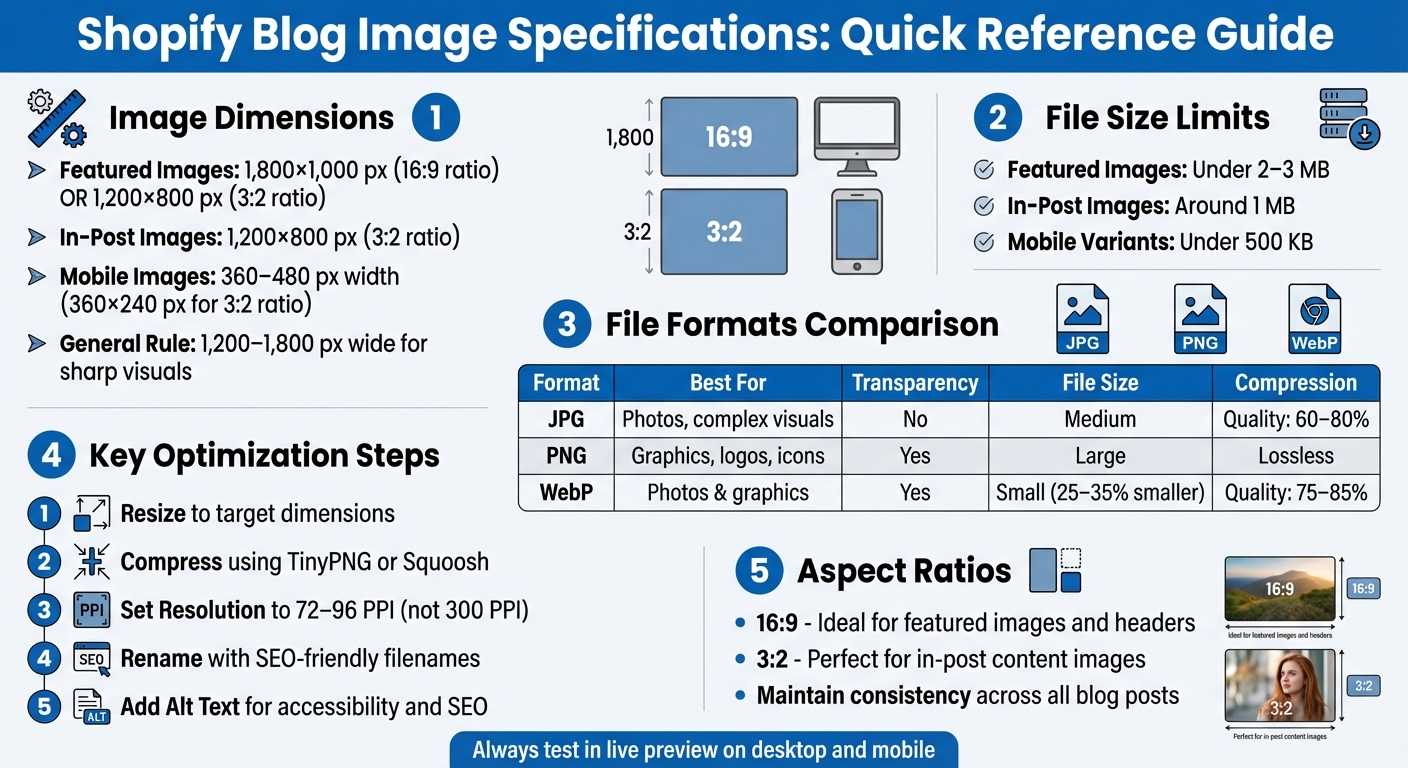
- Image Dimensions: Use 1,200–1,800 px wide for sharp visuals. Featured images should be 1,800×1,000 px (16:9) or 1,200×800 px (3:2).
- File Size: Keep featured images under 2–3 MB and in-post images around 1 MB for faster page loads.
- Aspect Ratio: Maintain consistent ratios (16:9 or 3:2) to avoid awkward cropping.
- File Formats: Use JPG for photos, PNG for graphics with transparency, and WebP for smaller file sizes.
- Compression: Compress images with tools like TinyPNG or Squoosh to reduce size without losing quality.
- Alt Text: Add descriptive alt text for accessibility and SEO.
Shopify Blog Image Specifications Quick Reference Guide
Shopify Blog Image Basics

How Shopify Handles Image Delivery
When you upload an image to your Shopify blog, it gets stored on a global content delivery network (CDN). This CDN automatically generates multiple resized versions of your original image, ensuring that the platform serves the most appropriate size for different devices. For example, a featured image might display at 1,098×550 px on desktops and 480×270 px on mobile devices [1].
Shopify always scales images down, never up. That means you should start with images that are at least as wide as the largest display area you’re targeting. If you upload an image that’s only 600 px wide for a blog section designed to display at 1,200 px, the result will appear pixelated. To keep your visuals sharp, aim for images that are 1,200–1,800 px wide for blog content. However, avoid uploading massive files - like images that are 5,000 px wide and 15–20 MB in size - as they can slow down page load times, especially for mobile users [3].
Now, let’s dive into the key technical details for optimizing your blog images.
Image Specifications: Dimensions, File Size, Aspect Ratio, and Resolution
To ensure your blog images look great and load quickly, focus on these four technical elements:
- Dimensions: This refers to the pixel width and height of an image (e.g., 1,200×800 px). Match these dimensions to your blog's content width to avoid unnecessary scaling.
- File Size: This is the amount of data your image uses, measured in KB or MB. For faster page loads, keep featured images under 2–3 MB and in-post images around 1 MB.
- Aspect Ratio: The ratio of an image’s width to its height (e.g., 3:2 or 16:9). Maintaining consistent aspect ratios prevents awkward cropping in grids or mobile views.
- Resolution (DPI or PPI): While resolution matters for print, on the web, the actual pixel dimensions are what dictate image clarity.
Standard Blog Content Widths in Shopify
Most modern Shopify themes display the main blog content column at widths between 1,000 and 1,200 px on desktop [2]. Since Shopify’s CDN doesn’t upscale images, uploading files that are 1,200–1,800 px wide ensures your content looks crisp without wasting bandwidth. For example, if your theme’s article body is about 1,100 px wide, a 1,200×800 px (3:2) image works perfectly. This size provides enough resolution for full-width content while allowing some flexibility for cropping or scaling.
To fine-tune your image choices, test a sample post in your live theme. Use your browser's inspector tool to check the rendered image width before finalizing your assets. This extra step ensures your visuals are optimized for your blog layout.
Image optimization tips for your Shopify store
Selecting Image Sizes and Aspect Ratios
After understanding how Shopify manages images, the next step is to nail down the right dimensions for each visual element in your blog. Whether it’s featured images, in-post visuals, or thumbnails, each serves a specific purpose and has ideal sizes and aspect ratios to ensure a polished look. Let’s break it down.
Featured Image Dimensions
Featured images are the main visuals that sit at the top of your blog posts and appear in listing grids. For most modern Shopify themes, the sweet spot is 1,800×1,000 px (16:9) - perfect for headers and card layouts [2]. If you’re working with a lighter file or a narrower theme, go with 1,200×800 px (3:2). Both options strike a balance between high resolution for Retina displays and manageable file sizes. Try to keep these images under 2–3 MB to avoid slowing down load times.
Consistency matters. Using the same aspect ratio across all featured images ensures your blog listing pages look neat and aligned. Always test your chosen dimensions in live previews to confirm everything looks just right.
In-Post Images and Thumbnail Sizes
Now let’s talk about the visuals embedded within your blog posts and their thumbnails. For in-post images, aim for 1,200×800 px (3:2), which works well for desktop layouts [2]. Since most Shopify blog content areas are narrower than 1,000 px, this size provides extra resolution for Retina screens without bloating the file size. Keep individual image files under 1 MB to ensure smooth page loading.
Thumbnails, often auto-generated from your featured images, have their own sizing considerations. Standard card layouts typically display thumbnails at around 500–600 px wide, while larger primary cards can be approximately 1,098×550 px. To ensure sharp, pixel-free thumbnails, upload featured images with widths between 1,200 and 1,800 px, allowing Shopify's CDN to handle downscaling automatically.
Mobile-Friendly Image Sizing
For smartphone users, smaller images are key. Keep mobile visuals around 360–480 px in width for a crisp display. If your theme or page builder supports device-specific images, create mobile variants sized at 360×240 px (3:2) and aim for file sizes under 500 KB. This reduces bandwidth usage without compromising image quality.
Also, pay attention to any text included in your graphics. Make sure it’s easy to read on smaller screens - if users need to pinch-zoom, it’s time to simplify the design or create a mobile-specific version. Always preview your blog on mobile devices to confirm everything looks sharp and functions smoothly.
Preparing Image Files for Fast Loading
Once you've nailed down the right dimensions, the next step is making sure your image files load quickly without compromising on visual quality. By using the right file formats, compression techniques, and resolution settings, you can significantly reduce file sizes and keep your blog running smoothly.
Image File Formats: JPG, PNG, and WebP
Picking the right format can make a huge difference in both file size and image quality. Here's a breakdown of the most common options:
- JPG (or JPEG): Ideal for photos and complex visuals with gradients. It uses lossy compression, which shrinks file sizes while maintaining acceptable sharpness. Use JPG for featured images or in-post photos where slight compression artifacts won’t be noticeable.
- PNG: Perfect for graphics, logos, icons, and screenshots that need a transparent background. PNG uses lossless compression, so images remain crystal clear, but the file sizes are larger. Save PNGs for situations where transparency or pixel-perfect detail is essential.
- WebP: A modern format developed by Google, WebP supports both lossy and lossless compression. It typically produces files that are 25–35% smaller than JPGs at the same quality level. Since most modern browsers support WebP, it’s an excellent choice when you want smaller file sizes for both photos and graphics.
Here’s a quick comparison to help you decide:
| Format | Best For | Transparency | File Size | Usage |
|---|---|---|---|---|
| JPG | Photos, featured images, complex visuals | No | Medium | Featured blog images, in-post photos |
| PNG | Graphics, logos, icons, screenshots | Yes | Large | Graphics with transparency, text-heavy images |
| WebP | Photos and graphics needing smaller files | Yes | Small | When browser support and speed are priorities |
Once you’ve chosen the right format, the next step is compressing the files efficiently.
Compressing Images Without Quality Loss
Compression is where you can make the biggest impact on loading speed. For JPG images, aim for a quality setting between 60–80% in your design software or compression tool. This can reduce file sizes by 50–70% while keeping the visual quality intact. For PNG files, tools like TinyPNG or Squoosh.app can strip unnecessary metadata and reduce color depth, significantly shrinking file sizes without affecting transparency. For WebP, use a quality setting of 75–85% for photos and switch to lossless mode for graphics.
There are plenty of free tools to make this process easy, including TinyPNG, Squoosh.app, and ImageOptim. Simply upload your image, adjust the quality slider, and preview the result at 100% zoom to ensure details like text and edges stay sharp. Always compress your images before uploading them to Shopify or any other platform - starting with optimized files ensures the best balance between quality and performance.
Web Resolution and DPI Settings
Forget about saving images at 300 ppi (pixels per inch) for web use. Unlike print, screens display images based on pixel dimensions, not resolution. Most web browsers and devices render images at around 72–96 ppi, so using a higher DPI won’t make your images look sharper - it’ll just inflate the file size unnecessarily.
For instance, a 1,200×800 px image saved at 300 ppi will have a much larger file size than the same image saved at 72 ppi, even though they’ll look identical on a screen. To optimize for the web, resize your images to the desired pixel dimensions (e.g., 1,800×1,000 px for featured images) and set the resolution to 72–96 ppi before exporting. Tools like Photoshop, Canva, or Figma allow you to confirm these settings during export, ensuring your images are web-ready and load quickly.
sbb-itb-8b1a57a
Adding and Formatting Images in Shopify's Blog Editor
Once your images are optimized and ready, you can easily add them to your blog posts using Shopify's editor, whether you're working on a desktop or mobile device.
Uploading Images to Blog Posts
To upload an image in Shopify, go to your admin panel and navigate to Online Store → Blog posts. From there, either click Add blog post to create a new post or open an existing one. In the Content editor, click Insert image. You can choose an image from Shopify's file library or upload a new one by selecting Upload file. After picking the image, use the Size drop-down menu to adjust its dimensions, with options like original, large, medium, small, or theme-specific sizes (e.g., "Product image (480px)"). You can also add a clickable link to the image before placing it in your post. [1]
If you're working on mobile, open the Shopify app, go to Online Store → Blog posts, and either create or edit a post. Follow the same steps to upload an image from your device or Shopify's file library. Keep in mind that mobile previews are limited, so it’s best to finalize the layout on a desktop. [1]
After inserting the image, adjust its placement to ensure it blends naturally with your text.
Image Alignment and Spacing
Once an image is added, click on it to access alignment options like left, center, or right. For visuals that span the full width of your post - such as diagrams or hero images - center alignment without text wrapping often creates the cleanest look. If you're embedding smaller supporting images, like product close-ups, aligning them to the left or right with text wrapping can give your post a polished, magazine-like appearance. Be cautious, though, as this layout might feel cramped on smaller screens.
To maintain a balanced look, add a blank line above and below each image and preview your post to check for consistency. If your theme applies tight spacing by default, you can work with a Shopify designer or an agency like Martin Monroe Creative to implement CSS adjustments. This ensures that all inserted images automatically have consistent spacing without needing manual tweaks. For posts featuring multiple images, such as step-by-step guides, keep the spacing equal between images to avoid uneven stacking.
Writing Alt Text for Images
After positioning your images, don’t overlook the importance of writing clear and descriptive alt text - it’s a simple way to boost both accessibility and SEO.
Click on the inserted image to open its settings and find the Alt text field. Enter a concise, plain-language description that explains what the image shows and its relevance to your content. For instance, instead of using a generic filename like "IMG_2047", you could write something like "Woman wearing our blue cotton summer dress on a city sidewalk." For featured images, click Edit image in the featured image section to add alt text there as well.
Good alt text should be specific and context-aware, helping blind or low-vision readers understand the image while naturally incorporating relevant keywords. Avoid starting with phrases like "image of" or "picture of", as screen readers already indicate that it’s an image. Here are some examples of effective alt text:
- "Close-up of the stainless-steel clasp on our men's black leather watch"
- "Before-and-after comparison showing a living room without and with our 8×10 gray area rug"
- "Step 3: Selecting 'Insert image' in the Shopify blog post editor on desktop"
- "Size chart for women's T-shirts in U.S. sizes from XS to XXL"
Making alt text a regular part of your workflow not only ensures your content is accessible to all audiences but also gives your SEO a boost.
Building a Repeatable Image Workflow
A consistent image workflow not only saves time but also helps avoid common mistakes like oversized files, uneven aspect ratios, or missing alt text. By sticking to a clear process for every blog post, your content maintains a polished look, and your pages load faster - key for U.S. mobile users who expect fast and seamless browsing experiences.
Creating an Image Style Guide
Start by documenting your image standards. Define dimensions and aspect ratios, such as setting featured images to 1,800×1,000 px with a 16:9 ratio and in-post images to 1,200×800 px with a 3:2 ratio. Establish maximum file size limits - for instance, keeping in-post images under 1 MB and featured images under 2–3 MB, even though Shopify allows uploads up to 20 MB.
Lay out cropping rules to keep key elements centered, specify alignment defaults (e.g., full-width for hero images, centered for product shots), and outline alt-text guidelines for writing concise, descriptive captions. Don’t forget to apply U.S.-specific formatting for units, prices, and dates. A detailed guide like this ensures everyone - whether it’s your internal team or an external agency like Martin Monroe Creative - can create visuals that align with your brand without guesswork.
Once you’ve nailed down the style guide, focus on organizing your image files to make uploads seamless.
Managing Your Image Files
Use SEO-friendly filenames to make images easy to find and improve search rankings. For example, name your file blog-image-workflow-featured-02-2025-01.jpg instead of something generic like IMG_1234.jpg. Organize files by year and post, such as:
-
/Shopify_Blog_Images/2025/how-to-format-images-in-shopify-blogs/featured/ -
/Shopify_Blog_Images/2025/how-to-format-images-in-shopify-blogs/in-post/
Separate your files into source images and web-ready versions, and only upload the optimized, web-ready files to Shopify. To keep track of everything, maintain an image log in a spreadsheet. Include columns for file name, post URL, upload date (formatted as MM/DD/YYYY, e.g., 02/15/2025), and last update. This makes it easy to monitor live images and conduct audits when needed.
Step-by-Step Image Workflow
Here’s a streamlined workflow to ensure consistency and speed:
- Source: Capture product photos or find licensed, brand-appropriate stock images.
- Edit: Adjust exposure, colors, and crop images based on your style guide.
- Resize: Scale images to your standard dimensions (e.g., 1,800×1,000 px for featured images or 1,200×800 px for in-post images).
- Compress: Use tools to reduce file size without sacrificing quality. Keep featured images under 2–3 MB and in-post images under 1 MB.
- Rename: Follow your SEO-friendly naming convention before exporting.
- Upload: Add the web-ready files to your Shopify blog.
- Format: Check alignment and ensure the layout looks good on both desktop and mobile.
- Add Alt Text: Write descriptive alt text that includes relevant details or keywords.
- Preview: Review the post on desktop and mobile to check for proper cropping, text readability, and fast load times.
Set checkpoints to review images at critical stages: after editing (to confirm color and composition), after resizing and compressing (to verify sharpness), and during the Shopify preview (to check layout). A simple two-step approval process works well - have a designer or marketer confirm the images align with the style guide, and let the content owner ensure they match the post’s message. Keeping a one-page workflow checklist handy near your content calendar can help your team stick to the process, reducing mistakes and speeding up publication.
Conclusion
Optimizing images for your Shopify blog isn't just about aesthetics - it directly impacts your site's load times, search engine rankings, and how users interact with your content. By following best practices like using optimized image formats and adding descriptive alt text, you ensure your blog is accessible, professional, and performs well across all devices.
Once your images are optimized, having a reliable workflow makes all the difference. A clear process - from sourcing and editing to compressing, renaming, and uploading - saves time and avoids common pitfalls like oversized files or missing alt text. Creating an image style guide and organizing files with SEO-friendly names and logical folder structures can help maintain consistency across your blog, making it easier for your team to collaborate effectively.
If this feels overwhelming, you don’t have to go it alone. A Shopify-focused agency like Martin Monroe Creative can simplify the process. Their expertise in graphic design and web development ensures your images align with your brand while meeting all technical requirements. They handle the details, so you can concentrate on delivering meaningful content to your audience.
FAQs
What is the best image format to use for my Shopify blog?
When selecting an image format, it’s all about matching the format to your content. JPEG is a go-to choice for photos or colorful images because it balances quality and file size effectively. If you're working with graphics or need transparency and crisp details, PNG is the better option. For those prioritizing faster load times without sacrificing visual quality, WebP is worth considering - it delivers high-quality images with even smaller file sizes. Picking the right format can make your blog visually appealing while keeping it fast and efficient.
How can I compress images for Shopify blogs without losing quality?
To make your images web-friendly without losing their visual appeal, try tools like TinyPNG or ImageOptim to shrink file sizes efficiently. Select the appropriate format based on your content: go with JPEG for photos and PNG for graphics that need transparency. Also, resize images to fit the largest display size they'll be shown at - there's no need for overly high resolutions. For online use, stick to a resolution of 72-96 DPI. Lastly, consider enabling lazy loading to speed up your page load times and create a smoother experience for your visitors.
How do I make sure my images look great on mobile in Shopify blogs?
When crafting Shopify blog posts, making your images mobile-friendly is key. Start by focusing on size, resolution, and format. Opt for responsive formats like WebP and aim for image widths under 1080 pixels - this ensures a balance between sharp visuals and fast loading times. Compress your images to keep file sizes small, but don’t compromise on clarity.
Position your images carefully to enhance your content without cluttering the layout. Before publishing, always preview your posts on a mobile device to see how the images appear and tweak them if needed. For tailored advice, experts like Martin Monroe Creative can help fine-tune your Shopify blog for optimal mobile performance.