
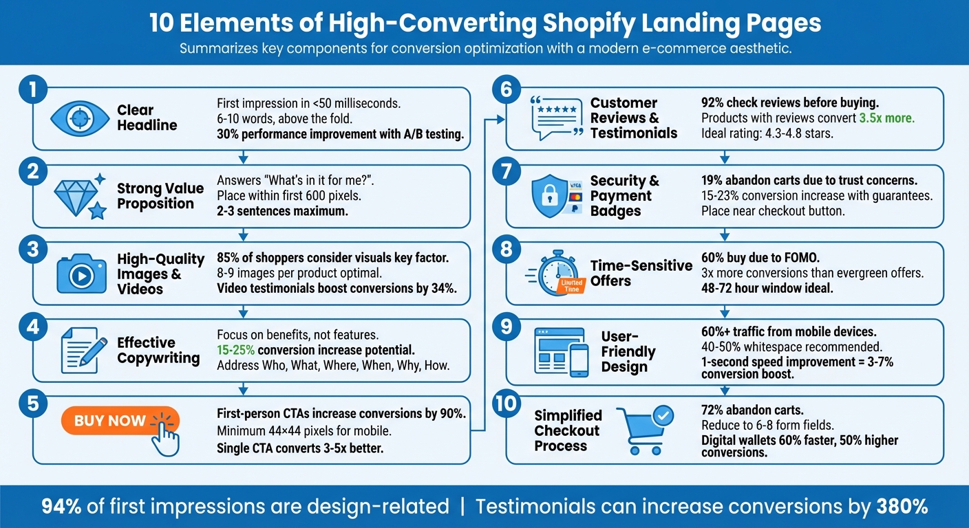
Your Shopify landing page has one job: convert visitors into customers. To achieve this, it must grab attention fast, clearly communicate value, and guide users toward action. Here are the 10 key elements that make a Shopify landing page perform:
- Clear Headline: Instantly communicates value and grabs attention.
- Strong Value Proposition: Explains why your product is the best solution to the visitor's needs.
- High-Quality Images and Videos: Showcases your product visually to build trust and engagement.
- Effective Copywriting: Focuses on benefits, addresses concerns, and drives action.
- Visible Call-to-Action Button: Easy to find, action-oriented, and encourages clicks.
- Customer Reviews and Testimonials: Builds trust through social proof.
- Security and Payment Badges: Eases concerns about data safety and payment reliability.
- Time-Sensitive Offers: Creates urgency to encourage immediate action.
- User-Friendly Design: Makes navigation simple and removes obstacles to conversion.
- Simplified Checkout Process: Reduces friction and cart abandonment rates.
A high-converting landing page combines these elements seamlessly to create a smooth user experience and drive results. Each piece works together to build trust, highlight benefits, and remove barriers to purchase.
10 Essential Elements of High-Converting Shopify Landing Pages
Complete DTC Landing Page Masterclass 2026: Build High‑Converting Shopify Pages

sbb-itb-8b1a57a
1. Clear Headline
Your headline is the first thing visitors notice, and it needs to make an impact fast. Studies show people form an impression in less than 50 milliseconds, so your headline must immediately communicate value. If it doesn’t answer questions like "What’s in it for me?" or "Why should I choose you?", visitors are likely to leave without exploring further.
Drives User Engagement
A strong headline acts as a hook, grabbing attention and setting the tone for the rest of the page. The secret? Focus on outcomes, not features. For instance, instead of saying "Durable Hiking Boots", try something like "Conquer Any Trail with Boots That Never Quit". This approach speaks directly to the user’s needs and aspirations.
For maximum impact, keep your headline short and punchy - about 6 to 10 words. Position it above the fold so it’s visible without scrolling, and ensure it’s easy to read on mobile devices. A good rule of thumb is maintaining a text-to-background contrast ratio of at least 4.5:1. Take this example: "Healthy smoothies anytime, without the kitchen mess" is far more engaging than "USB-rechargeable 6-blade portable blender" because it highlights the benefit and convenience.
Builds Trust and Credibility
A clear headline doesn’t just engage - it also builds trust. To do this, it must align with the keywords or ad text that brought the visitor to your page. Imagine clicking on an ad that promises "20% Off Skincare" but landing on a page with a vague headline like "New Product Launch." The disconnect erodes trust and increases bounce rates. Consistency between your ad and headline reassures visitors they’re in the right place.
To refine your headline, A/B test 3 to 5 variations to see which one resonates best. Look for the version that reduces bounce rates and boosts engagement metrics. Regularly testing headlines can lead to a 30% improvement in performance over time.
A clear, benefit-driven headline lays the groundwork for everything else on your page. It’s the first step in creating a seamless and engaging user experience.
2. Strong Value Proposition
Once your headline grabs attention, the next step is a clear and focused value proposition. This is where you answer the question every visitor is asking: "What’s in it for me?" A value proposition highlights the unique benefits of your product or service and explains why it’s the best solution. Unlike a mission statement, this is all about addressing customer needs directly. A well-crafted value proposition sets the tone for a positive and engaging visitor experience.
Drives User Engagement
An effective value proposition quickly communicates the benefits, helping to keep visitors from leaving your page too soon. The key is to focus on outcomes rather than features. For example, “In-demand bras that make you look great and feel even better” speaks directly to the customer’s desired result - their dream outcome.
To create a compelling value proposition, you can use proven frameworks like Steve Blank’s XYZ formula: “We help [Target Customer] do [Job] by [Solution].” For instance, “We help teams stay aligned by bringing all communication into one place.” Another option is the Shopify Aspiration formula: “[Adjective] [Product/Service] for [Aspiration].” Make sure your value proposition is placed prominently above the fold - ideally within the first 600 pixels - so it’s one of the first things visitors see.
Builds Trust and Credibility
Clarity is essential for building trust. Your value proposition should be concise - just two or three sentences - and avoid exaggerated claims or vague phrases like "world's best".
Using authentic language, especially drawn from customer feedback, can further enhance credibility. For example, Pela, a brand known for its eco-friendly phone cases, builds trust by highlighting its impact: preventing 92,407,579 plastic bags from entering waste streams.
Encourages Conversions
A strong value proposition can directly boost conversions by addressing four key elements: the dream outcome (what the customer wants to achieve), the likelihood of success (supported by trust signals and guarantees), the time delay (how quickly results will be seen), and the effort required (why the investment is worth it). Running A/B tests on 3–5 variations of your value proposition over at least two weeks can help lower bounce rates and improve engagement. By focusing on what matters most to your audience, you can significantly enhance the effectiveness of your landing page.
3. High-Quality Images and Videos
Drives User Engagement
Visuals grab attention fast - just three seconds or less. They tell your product's story instantly, creating an emotional connection that text alone often can't achieve. Lifestyle photos and demo videos go a step further, helping customers visualize how your product fits into their lives. Features like zoom, 360° views, and hover animations encourage users to explore your product in detail. On Amazon, top-selling products typically showcase six to nine images, and offering at least eight distinct "looks" mimics the in-store experience, making customers feel confident enough to hit "Add to Cart". These visuals not only spark interest but also set the stage for trust.
Builds Trust and Credibility
Just like a strong headline or clear value proposition, professional visuals are essential for building trust. Since online shoppers can’t physically interact with your products, high-quality photography acts as a stand-in, signaling professionalism and reliability.
On the flip side, blurry or poor-quality images can undermine your brand’s credibility. Interestingly, user-generated content (UGC) often builds trust even faster - four times faster, in fact - because it feels more genuine than polished brand videos. Video testimonials, especially when placed prominently in the hero section, have been shown to boost conversion rates by 34% for paid social traffic.
Encourages Conversions
High-quality visuals directly influence buying decisions - 85% of shoppers consider them a key factor in their purchase. Detailed close-ups highlighting textures, stitching, or material quality give customers the confidence to buy, reducing hesitation and even lowering return rates. Speed also matters: a 0.1-second faster load time can increase conversions by 8.4%. To balance speed and quality, use modern image formats like WebP and apply lazy loading for images below the fold. For hero videos, keep them under 10MB, autoplay muted, and compress images to under 200KB for smooth performance on mobile devices.
4. Effective Copywriting
Once you’ve grabbed attention with a strong headline and a clear value proposition, the next step is crafting copy that turns curiosity into action.
Drives User Engagement
Good copy doesn’t just describe - it connects. Instead of saying a jacket has "waterproof fabric", explain how it "keeps you dry during your morning commute." This kind of language helps shoppers picture the benefits in their own lives. Use sensory words and action-packed terms like "Unlock", "Transform", or "Amazing" to make your message stand out. When your copy speaks to what people care about, it builds a natural sense of trust and keeps them engaged.
Builds Trust and Credibility
Just like great visuals, clear and honest copy helps build trust. When your audience knows exactly what you’re offering, they’re more likely to feel confident about buying. Address the basics - Who, What, Where, When, Why, and How - to remove any doubts. Being transparent about things like ingredient sourcing, return policies, or sustainability efforts shows you have nothing to hide.
Encourages Conversions
Tweaking your copy can lead to conversion increases of 15% to 25% for many Shopify stores. Address common concerns directly in your text, and use urgency to nudge buyers - phrases like "Only 3 left!" or "Sale ends tonight" can prompt quick decisions. Keep your call-to-action (CTA) simple and direct.
Make your content easy to skim by using clear headlines and bullet points - especially since over 60% of U.S. ecommerce purchases are now made on smartphones.
5. Visible Call-to-Action Button
Your CTA button is the final piece of the puzzle. Even if your landing page content is strong, it won't convert if visitors can't find the button or feel no urge to click. A well-designed, attention-grabbing CTA is what turns interest into action.
Drives User Engagement
A well-placed CTA encourages users to take the next step. Positioning it above the fold ensures it’s seen right away. Use bold, high-contrast colors and surround it with plenty of white space to make it pop. The wording matters, too - action-oriented phrases like "Get Brewing" or "Claim Your Discount" are much more effective than bland terms like "Submit." Fun fact: switching to first-person language, such as "Start My Free Trial" instead of "Start Free Trial," has been shown to increase conversions by up to 90%.
Improves User Experience
A clear CTA makes life easier for your visitors. Keep the text short - four words or less is ideal - and use direct, action-packed verbs like "Shop," "Get," or "Claim." With mobile traffic making up over 70% of Shopify store visits, ensure your buttons are at least 44×44 pixels for easy tapping. A sticky CTA that stays visible as users scroll can also be a game-changer, especially on smaller screens.
Encourages Conversions
Even small adjustments to your CTA can have a big impact. Adding microcopy like "No credit card required" or "Free 30-day returns" can ease doubts, while urgency-driven phrases like "Buy now - sale ends midnight" or "Only 3 left!" prompt immediate action. Don’t forget to test! A/B testing button colors, wording, and placement can reveal what resonates most with your audience. Interestingly, landing pages with a single, focused CTA often convert 3–5 times better than those with multiple competing goals.
6. Customer Reviews and Testimonials
Customer reviews are a powerful way to build trust by showcasing real experiences. The stats speak for themselves: 92% of consumers check online reviews before buying, and products with reviews convert at 3.5 times the rate of those without. This kind of social proof reassures potential buyers and strengthens earlier design and copy efforts by increasing perceived value.
Builds Trust and Credibility
Reviews provide third-party validation, showing that your brand delivers on its promises. This is particularly important for newer stores that haven’t yet established a reputation.
Interestingly, a mix of positive and negative reviews can feel more genuine. The key is to respond to criticism professionally, demonstrating that you value customer feedback and take accountability.
Drives User Engagement
User-generated content (UGC), especially photos, plays a big role in keeping visitors engaged. In fact, UGC photos are 5 times more effective than professional images. Seeing everyday people using your product makes it easier for potential customers to picture themselves doing the same. For example, in 2026, WiserNotify client Nicholas Scalice boosted signups by 32% on his opt-in page using real-time social proof notifications. Including authentic testimonials like these aligns perfectly with the goal of creating a focused landing page that leads visitors to convert.
Encourages Conversions
Trust and engagement naturally lead to higher conversion rates. Placing reviews and star ratings strategically - like on collection pages or near CTA buttons - can reduce hesitation and encourage action. WikiJobs, for instance, saw purchases jump by 34% after adding three short customer testimonials to their landing page.
For the best results, aim for 10–15 reviews for apparel items and 25+ for food or supplements, with an ideal star rating between 4.3 and 4.8. To collect reviews, send post-purchase emails 7–14 days after delivery with engaging subject lines. Follow up a week later to increase response rates.
7. Security and Payment Badges
Right after grabbing attention with strong headlines and eye-catching visuals, security and payment badges play a key role in earning user trust. One of the biggest hurdles in online shopping is trust, especially when it comes to sharing sensitive information. In fact, a 2025 survey revealed that 19% of US shoppers abandoned their carts because they didn’t trust the site with their credit card information. That’s nearly one in five potential sales lost due to security concerns.
Using familiar logos like Visa, PayPal, or Apple Pay can instantly tap into that trust. As Charlotte Muzzi from Shopify puts it:
"A secure checkout trust badge can reassure shoppers hesitant to share credit card information and other sensitive personal data online."
Builds Trust and Credibility
Payment and security badges act as visual assurances for customers. When shoppers see badges like "Secure Checkout" or an SSL certificate, they know their data is encrypted and safe. For example, Tower 28, a skincare brand, features endorsement badges from the National Eczema Association on its product pages. This third-party validation gives customers a "reason to believe" in the product’s safety and quality. Similarly, FactoryPure uses Better Business Bureau badges to address customer concerns.
Improves User Experience
Badges do more than inspire trust - they also simplify the shopping experience. Instead of long-winded explanations, a few well-placed logos can do the heavy lifting. For a polished look, stick to 2–3 high-quality, monochrome badges. Payment badges are most effective in the website footer and near the checkout button, while policy badges like "Money-Back Guarantee" or "Free Returns" work best under the "Add to Cart" button.
Encourages Conversions
These trust signals can break down psychological barriers to buying. For instance, placing risk-reversal badges (like a "60-Day Money-Back Guarantee") near the buy button has been shown to increase conversions by 15%–23%. The lingerie brand Mentionables includes a lineup of payment badges (like Shop Pay and American Express) in its homepage footer to align with trusted financial brands. Hatch takes it a step further by adding specific policy badges - such as "Warranty", "Free Shipping", and "30-Day Trial" - on product pages, easing concerns about purchasing high-ticket items.
When combined with strong CTAs and customer testimonials, security and payment badges create a powerful trust-building trifecta for your Shopify landing page.
8. Time-Sensitive Offers
Time-sensitive offers tap into the human tendency to avoid missing out, encouraging quick decisions. Adding a deadline to your landing page creates a sense of urgency, pushing customers to act now rather than postponing - or forgetting altogether.
Drives User Engagement
Countdown timers and flash sales grab attention and keep customers engaged. Did you know that 60% of consumers admit to making purchases because of FOMO (Fear of Missing Out)?. Even small tweaks like using deadline-focused language in email subject lines - think "ends tonight" or "last 4 hours" - can boost open rates by 22% and click-through rates by 31% compared to emails without time pressure. A single SMS sent just two hours before a promotion ends can drive 15–25% of total flash sale revenue.
Recurring deals, like weekly specials, train your audience to check back regularly, while early-access alerts for loyal customers create a sense of exclusivity and excitement around new launches. The trick is to ensure the urgency feels authentic and beneficial, not forced or manipulative.
Encourages Conversions
Limited-time promotions are incredibly effective, often delivering three times more conversions than evergreen offers. Flash sales, specifically, can increase transaction rates by 35%, while countdown timers boost conversion rates by 8–32%.
For Shopify stores, a 48–72 hour window is ideal - long enough to promote the deal across email and social channels, but short enough to maintain urgency. Strategically place countdown timers in highly visible spots, like the announcement bar for site-wide sales or just below the "Add to Cart" button for product-specific offers. Shipping deadline timers (e.g., "Order within 3 hours to receive it by Friday") are especially effective because they create urgency while providing practical value.
When done right, urgency-focused strategies not only drive conversions but also enhance the overall shopping experience.
Improves User Experience
Time-sensitive offers help customers overcome decision paralysis. Instead of endlessly comparing options or waiting for a better deal, a clear deadline motivates them to make a choice. Shipping timers are particularly useful because they highlight real-world constraints, helping customers plan their purchases effectively.
But here’s the golden rule: urgency must be ethical. Avoid shady tactics like countdown timers that reset upon refreshing the page or fake low-stock alerts.
Modern shoppers are savvy enough to spot dishonest practices, and fake urgency can permanently damage your brand’s reputation. Stick to genuine deadlines and authentic offers, and time-sensitive promotions will not only drive sales but also build trust and loyalty with your audience.
9. User-Friendly Design
A user-friendly design is the final piece of the puzzle when it comes to creating a landing page that converts. It removes obstacles, making it easy for visitors to navigate your page and take action. A cluttered or confusing layout can overwhelm users and push them away, but a clean, intuitive design ensures every interaction feels natural and effortless.
Improves User Experience
Good design isn’t just about aesthetics - it’s about making the visitor’s journey as smooth as possible. By incorporating 40–50% whitespace, establishing a clear font hierarchy (such as 32–48px for headlines and at least 16px for body text), and sticking to a single-column layout, you can create a page that feels clean and easy to read.
With more than 60% of eCommerce traffic coming from mobile devices, mobile optimization is non-negotiable. Make sure buttons and interactive elements are at least 44x44 pixels to meet mobile usability standards. Additionally, focus on fast load times for mobile users - compress images to under 300KB, use modern formats like WebP, and aim for a Largest Contentful Paint (LCP) of under 2.5 seconds. These tweaks not only improve usability but also keep visitors engaged longer.
Encourages Conversions
When it comes to boosting conversions, simplicity is your best friend. For example, reducing the number of form fields from 15 to just 5 can increase checkout completion rates by 25–40%. Similarly, improving page speed by even one second can lead to a 3–7% bump in conversions.
To keep users focused, remove extra navigation links and distractions. Use high-contrast colors for call-to-action (CTA) buttons, and place these buttons strategically - above the fold, mid-page after showcasing key benefits, and at the bottom of the page.
For longer forms, break them into smaller, digestible steps using progressive disclosure. Provide real-time feedback with inline validation, and use smart defaults to reduce the effort required for users to complete actions. The easier you make the process, the more likely visitors are to convert.
10. Simplified Checkout Process
The checkout process is often the final step - and sometimes the most frustrating - for online shoppers. With 72% of online shoppers abandoning their carts, and 18% citing overly long or complicated checkouts as the reason, simplifying this step is critical. Every unnecessary field or confusing step adds friction and increases the likelihood of cart abandonment.
Improves User Experience
A streamlined checkout process is essential for maintaining a positive user experience. Start by reducing form fields to the bare minimum. Instead of the ecommerce average of 11.3 fields, aim for 6–8 fields. Smart defaults can also make a big difference: pre-select options like "billing address same as shipping" and use tools like Google-powered address autocomplete to save time and effort.
Breaking the checkout into smaller, digestible steps can also help. By using a progress indicator, you reassure customers and make the process feel less overwhelming. This method, known as progressive disclosure, allows users to focus on one step at a time while clearly seeing how close they are to completing their purchase.
Encourages Conversions
A simplified checkout isn't just about making things easier - it's also about driving results. Faster checkouts directly impact conversion rates. For example, in July 2025, the snack brand Muddy Bites reported an impressive 1,167% year-over-year growth after adopting a one-click accelerated checkout system. Cofounder and CEO Jarod Steffes highlighted how this change also led to an 8% increase in repeat customer orders thanks to Shop Pay.
"We have a one-click checkout system that has a very high conversion rate with extreme growth." - Jarod Steffes, Cofounder and CEO, Muddy Bites
Digital wallets like Shop Pay, Apple Pay, and Google Pay are game-changers for returning customers. These tools allow purchases to be completed in just 0.7 seconds, making the process 60% faster and boosting conversions by up to 50% compared to guest checkout.
To further reduce friction, make guest checkout the default option - forced account creation leads to a 19% cart abandonment rate. Additionally, displaying familiar payment logos and security badges near the payment form can ease last-minute hesitations and build trust.
A well-designed checkout process ties everything together, ensuring customers feel confident and motivated to complete their purchase.
Conclusion
Creating a Shopify landing page that drives conversions isn’t about focusing on just one element - it’s about bringing together all ten elements in harmony. Each piece plays a critical role: a headline grabs attention, the value proposition highlights benefits, visuals forge a connection, copy addresses concerns, trust signals establish credibility, and a smooth checkout process ensures the deal is closed. When these elements work together, your landing page becomes a highly effective digital salesperson.
The stats speak for themselves: 94% of first impressions are tied to design, and customer testimonials can increase conversion rates by as much as 380%. Every detail matters, from the color of your CTA button to the placement of trust badges. All of these elements need to align with a single conversion goal to maximize impact.
To achieve a landing page that performs at this level, you need more than just a good idea - you need a solid strategy. Success requires expertise in design, understanding user behavior, and technical fine-tuning. That’s why working with professionals can make all the difference. Agencies like Martin Monroe Creative specialize in this kind of strategic execution. They bring together personalized development, benefit-focused copywriting, and ongoing A/B testing to ensure your landing page becomes a true revenue generator. From optimizing load times to crafting persuasive messaging, they handle every detail to help convert more visitors into customers.
FAQs
Which landing page element should I optimize first?
The headline or value proposition is your first chance to grab attention and make an impression. It’s the cornerstone of your message, clearly highlighting the main benefit of your offer. Nail this part, and you’re already setting the stage for better conversions. Why? Because it ensures your audience immediately understands the value you bring to the table.
How many reviews do I need to boost conversions?
Having reviews on your Shopify landing pages can make a big difference in building trust and credibility. While there’s no set minimum number of reviews needed to improve conversions, showcasing customer feedback can encourage potential buyers to take action, ultimately influencing your conversion rates in a positive way.
What’s the best way to A/B test headlines and CTAs in Shopify?
When testing headlines and CTAs (calls-to-action) in Shopify, rely on data to make informed decisions. The idea is to compare different variations and see how they perform in terms of conversions. Start small - experiment with changes like the wording of a headline or the design of a button.
Make sure to use tools that work seamlessly with Shopify. Look for options that offer visual editors and provide detailed analytics so you can track performance effectively. This method allows you to pinpoint what connects with your audience, helping you refine your approach and boost conversion rates.